 It was tucked away in a backwater of The Wall Street Journal’s online Design tab, which is actually just a sub-section of their Real Estate section. “The Rise of the Colorful Bathroom” was like a conceptual hand grenade tossed into the placid lagoon of home decor orthodoxy.
As far as design insights likely to affect Palmetto’s home resale market, the pointers found in Design lately haven’t been particularly noteworthy. Earlier this month, there had been a piece about metal versions of “The Classic Peacock Chair.” That might have had some impact in Rangoon, but here in Palmetto, where peacock chairs are few and far in between, it scarcely ruffled a feather. Similarly, there had appeared “A Décor Lesson in Subtle Patriotism” with marginally subtle red, white and blue illustrations—but especially since it first appeared after the July 4th weekend, Palmetto readers were unlikely to run that one up the flagpole…
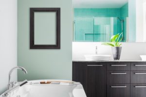
But now, tucked away beside a Most Popular Videos sidebar, came this subversive “Rise of the Colorful Bathroom.” A generous illustration showed an example of how far the author was willing to go: it portrayed a stark blue bathroom wall and sink featuring clapboard-like blue-and-gray porcelain tiles: the blue plank special. Did this mark a warning shot over the bow of one of the longest unchallenged home décor conventions—that the American bathroom palette should be, in the author’s phrase, “compulsively neutral”?
If so, would the new trend force homeowners poised to enter Palmetto’s home resale market to have to expensively retool their bathrooms’ calming hues?
Fortunately for the budgets of Palmetto home sellers, a close reading made that unlikely. Although the National Kitchen and Bath Association (NKBA) does report some tip-toeing by their members in the direction of bathroom color infusions, no more than 10%-15% of them actually expect to decorate more baths “in green, blue and black”—at least for this year. There were also tacit admissions that the Rise of the Colorful Bathroom might become somewhat diluted before it spreads much further. “Muted beats candy bright” was the caption describing a mid-toned bathroom, displaying an almost traditional “quiet, palatable personality.”
Some designers also expressed some reluctance to jump on the Colorful Bathroom train—at least in one part of the rainbow. Palm Springs designer Christopher Kennedy may opt for small touches of bright color, but will always “avoid pea greens and acid greens” because “they aren’t so great on the skin.” He goes in a rosier direction, with hip colors like blush “because it makes you look beautiful.”
As far as Palmetto home resale prospects are concerned, one devil-may-care subhead gives away a quite possible impact. The truly cool blues to emphatic blacks are labelled “resale-be-damned” colors. As we near the end of the hectic peak selling period, most Palmetto sellers are continuing to choose much more of a “resale-be-welcomed” disposition. If that describes your own stance, you’ll find it echoed when you get in touch with me!


Leave a Reply
You must be logged in to post a comment.